Project Overview
Project Overview
Know the Project
Know the Project
Maximus Oil & Gas is a leading energy-sector brand that required a modern, intuitive web presence. The objective was to design a user-centric interface that conveys trust, expertise, and technical capability in oil & gas operations.
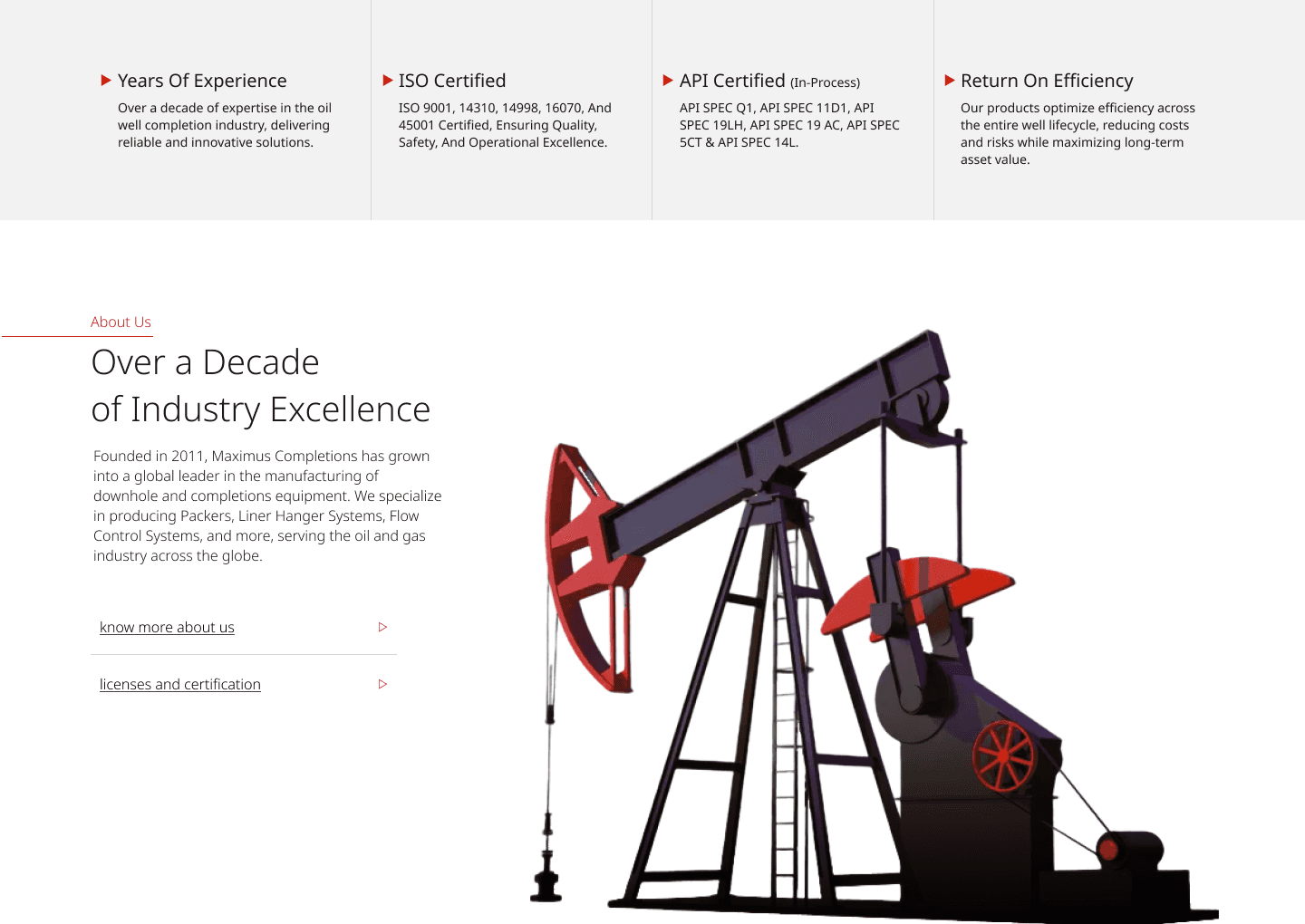
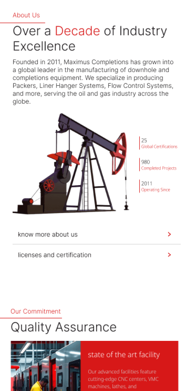


Project Goals
The Purpose
Establish a modern, professional web presence
Improve user navigation & engagement
Communicate complex services simply & visually
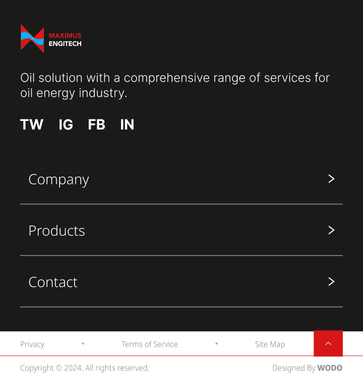
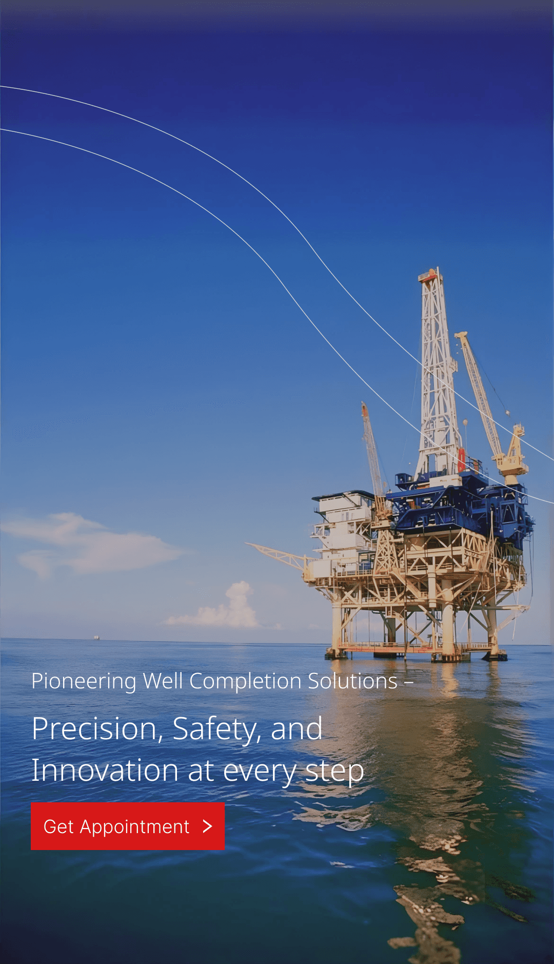
Ensure responsive design for field-accessibility
Highlight safety, sustainability, and innovation
Clearly establish brand Identity
UI Strategy
Reason behind Design
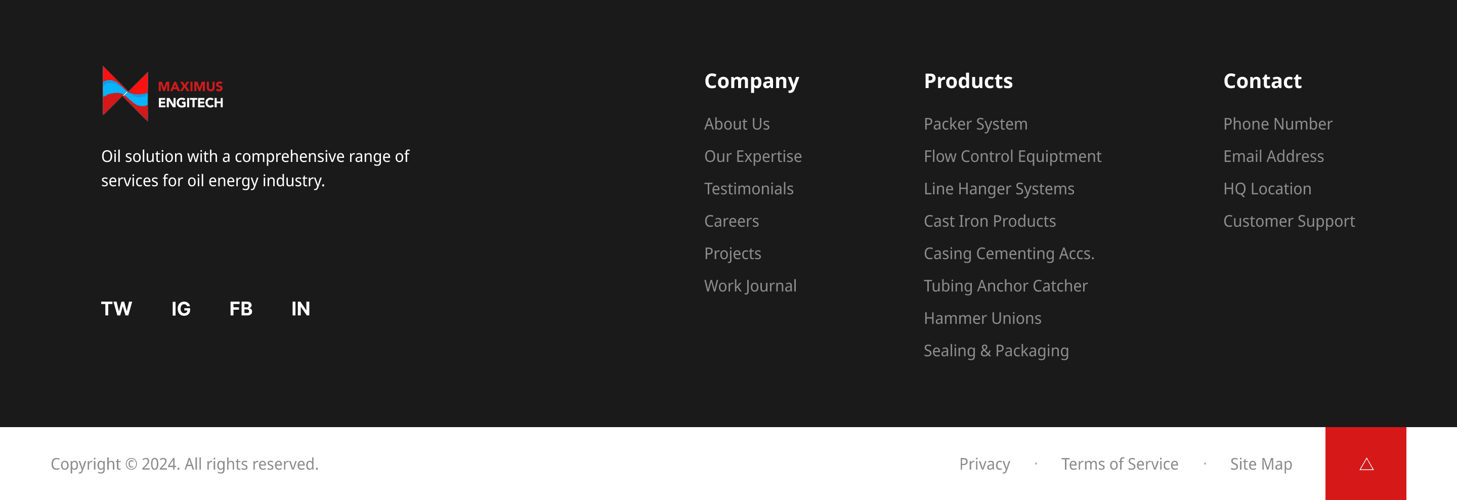
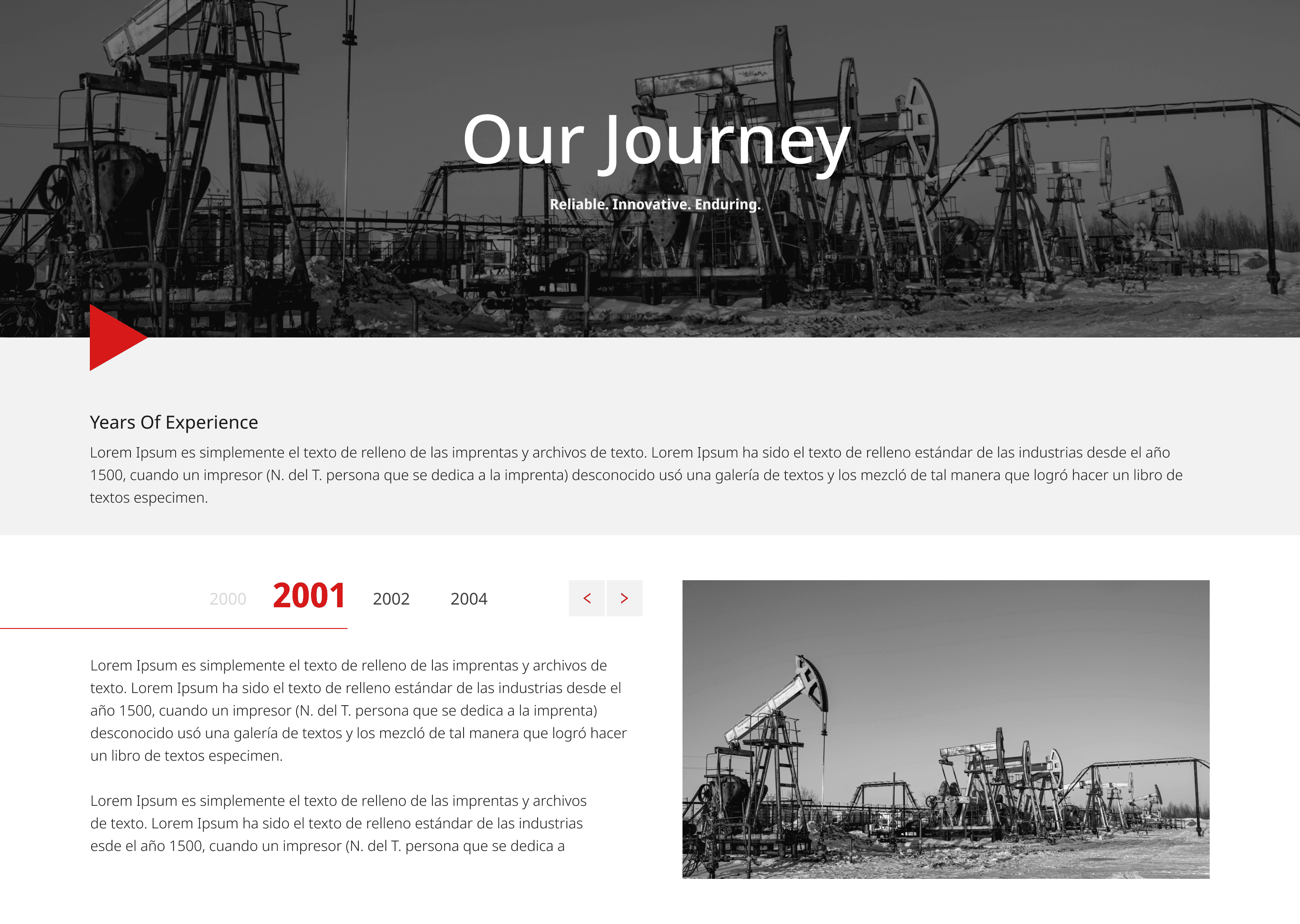
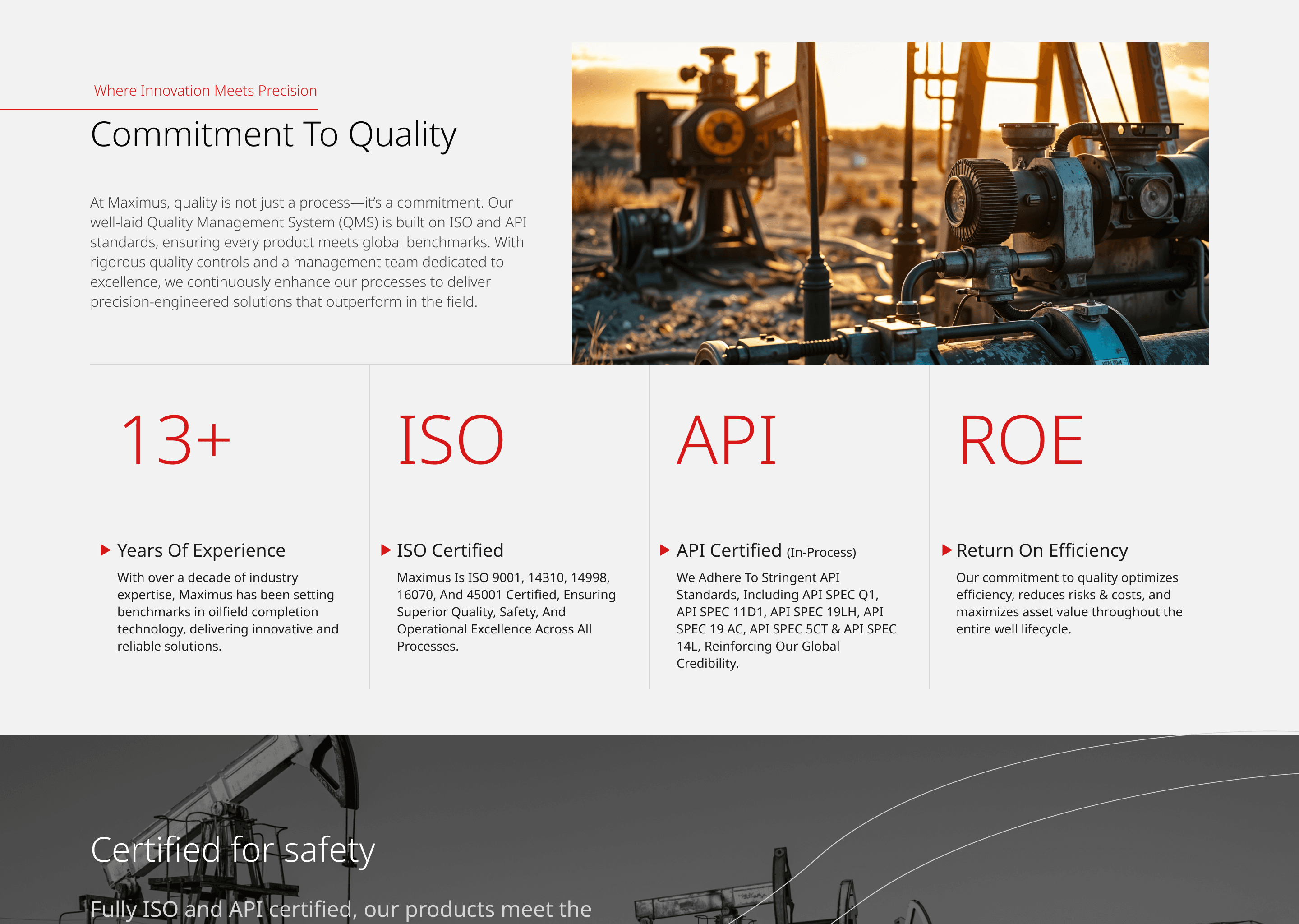
The design language is tightly aligned with the brand's identity as a precision-driven industrial engineering supplier. Every choice color, typography, structure, imagery - supports a perception of trust, engineering rigor, and efficiency. This resonates with decision makers in oil & gas sectors looking for proven, professional partners.
The design language is tightly aligned with the brand's identity as a precision-driven industrial engineering supplier. Every choice color, typography, structure, imagery - supports a perception of trust, engineering rigor, and efficiency. This resonates with decision makers in oil & gas sectors looking for proven, professional partners.
Bold Brand Identity & Color Palette
▷
Red, black & gray are prominent - reflecting industrial strength, energy, and reliability.
The red accent draws attention to key interactive elements (e.g., CTAs, navigation highlights), reinforcing brand recall and action cues
Red, black & gray are prominent - reflecting industrial strength, energy, and reliability.
The red accent draws attention to key interactive elements (e.g., CTAs, navigation highlights), reinforcing brand recall and action cues
Strong Typography & Hierarchy
▷
Typography is utilitarian: clear Noto Sans for improved readability.
Heading levels are distinct in size and weight, guiding users through content smoothly, ideal for technical B2B audiences.
Typography is utilitarian: clear Noto Sans for improved readability.
Heading levels are distinct in size and weight, guiding users through content smoothly, ideal for technical B2B audiences.
Geometric & Mechanical Motifs
▷
The design features structured, grid-based layouts with sharp, precise lines - echoing mechanical engineering precision.
Backgrounds or assets hint at pipework, flow diagrams, or waveforms, reinforcing the “completion systems” context.
The design features structured, grid-based layouts with sharp, precise lines - echoing mechanical engineering precision.
Backgrounds or assets hint at pipework, flow diagrams, or waveforms, reinforcing the “completion systems” context.
Visual Focus on Product Imagery
▷
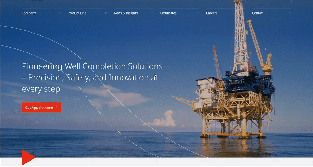
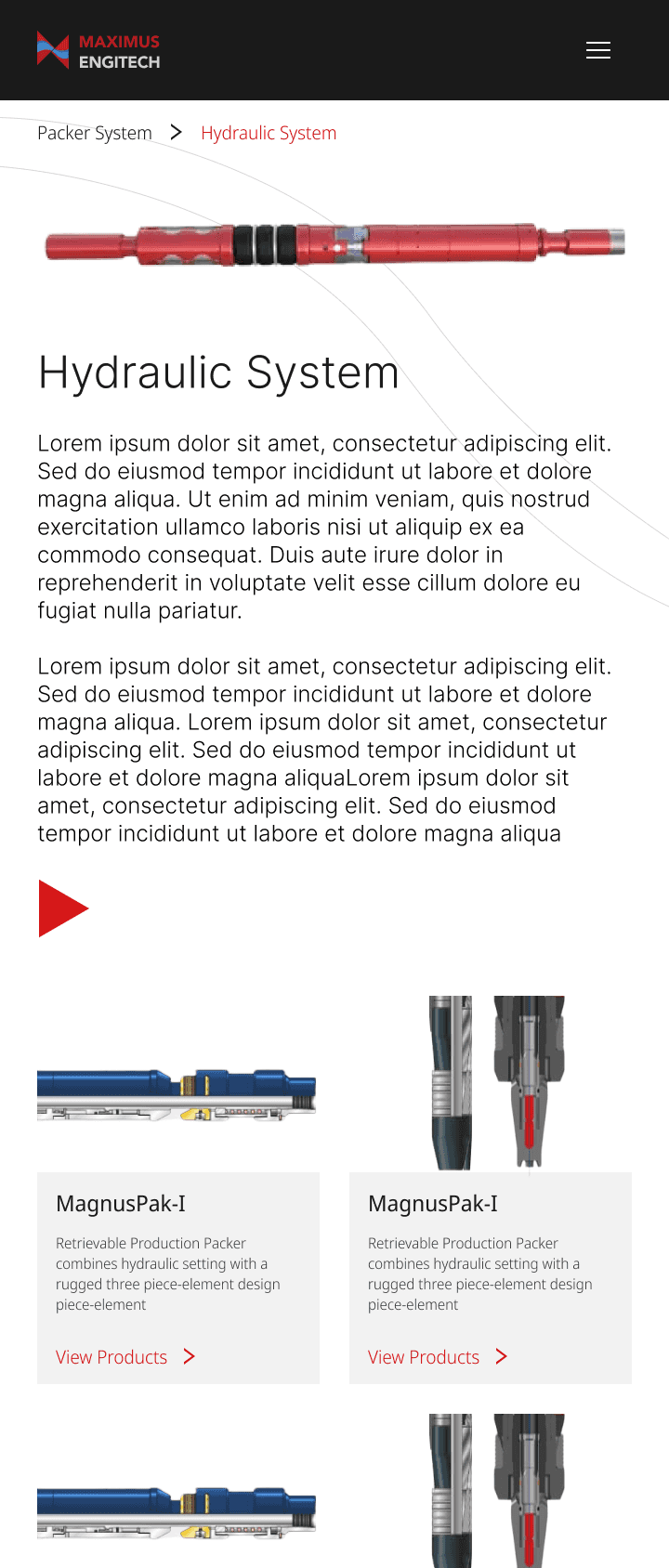
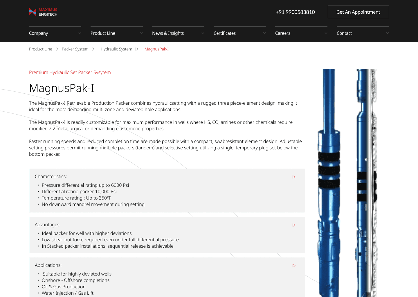
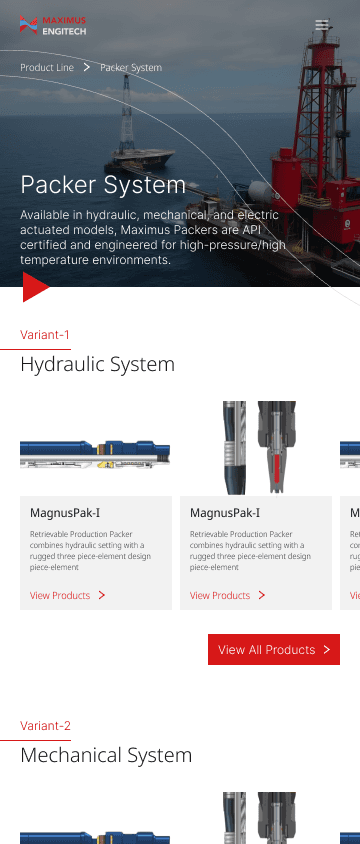
Hero areas and sections showcase real-world tools (packers, valves) - grounding the visual language in tangible industry products.
Clean product shots, often isolated, maintain professionalism and keep the focus on function.
Hero areas and sections showcase real-world tools (packers, valves) - grounding the visual language in tangible industry products.
Clean product shots, often isolated, maintain professionalism and keep the focus on function.
Straightforward Navigation & Functional UI
Straightforward & Functional
▷
Minimal menu structure with clear labels (e.g., Products, Contact).
A layout that de-emphasizes fancy interactions - prioritizing fast access to specs, brochures, or downloads.
Minimal menu structure with clear labels (e.g., Products, Contact).
A layout that de-emphasizes fancy interactions - prioritizing fast access to specs, brochures, or downloads.
Industrial UX Patterns
▷
Components (cards, lists) are boxy and modular, offering a sense of organization that's critical for engineering users.
Contrast (e.g., black text on white or gray backgrounds) ensures accessibility across screens and lighting conditions common in field environments.
Components (cards, lists) are boxy and modular, offering a sense of organization that's critical for engineering users.
Contrast (e.g., black text on white or gray backgrounds) ensures accessibility across screens and lighting conditions common in field environments.

UI Strategy
Reason behind Design
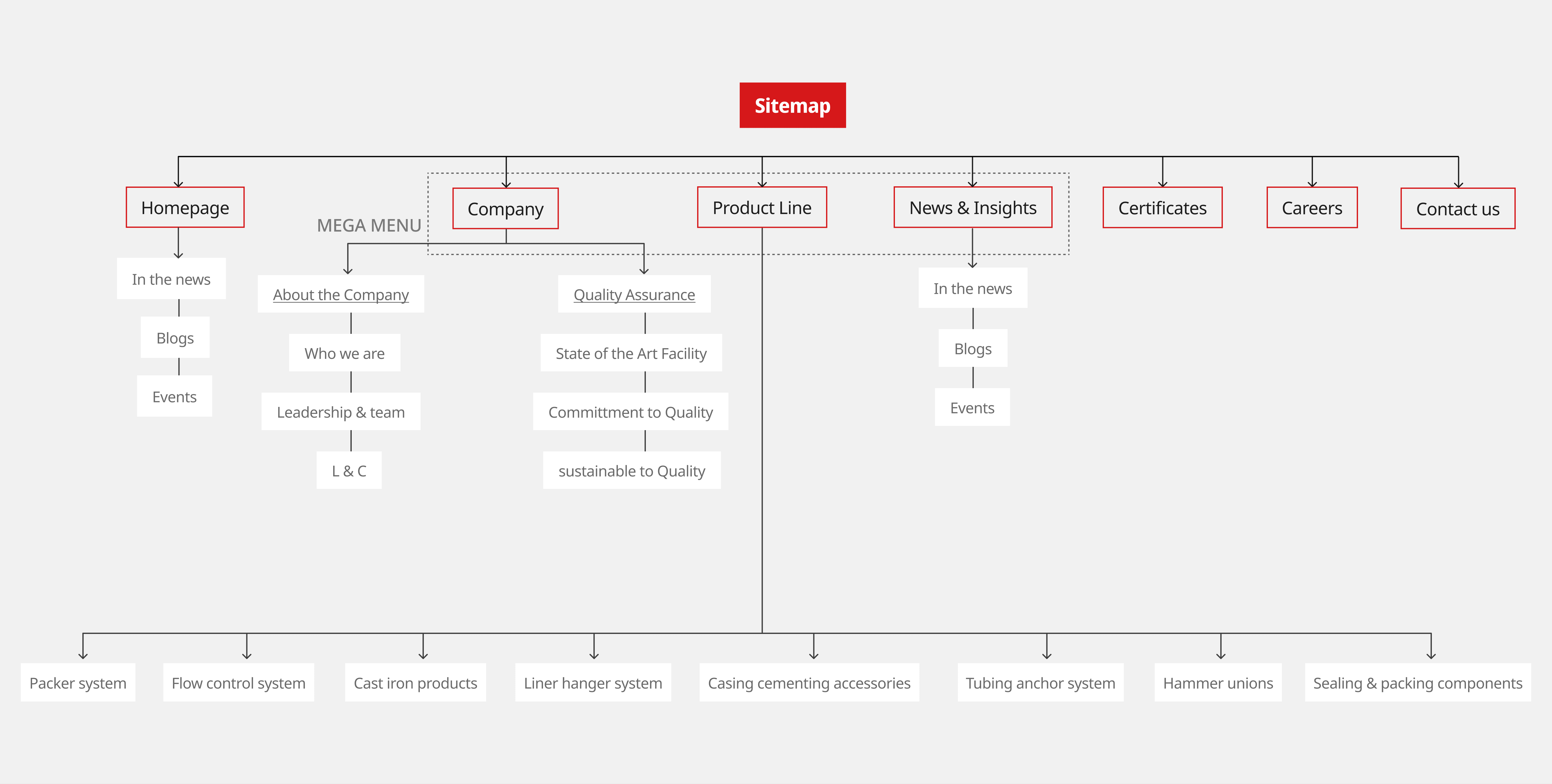
Sitemap
Sitemap
Homepage
Homepage
Certificates
Certificates
Contact us
Contact us
Packer system
Packer system
Flow control system
Flow control system
Cast iron products
Cast iron products
Liner hanger system
Liner hanger system
Casing cementing accessories
Casing cementing accessories
Tubing anchor system
Tubing anchor system
Hammer unions
Hammer unions
Sealing & packing components
Sealing & packing components
In the news
In the news
Blogs
Blogs
Events
Events
News & Insights
News & Insights
In the news
In the news
Blogs
Blogs
Events
Events
Product Line
Product Line
Company
Company
Who we are
Who we are
About the Company
About the Company
L & C
L & C
Leadership & team
Leadership & team
Quality Assurance
Quality Assurance
State of the Art Facility
State of the Art Facility
Committment to Quality
Committment to Quality
sustainable to Quality
sustainable to Quality
MEGA MENU
MEGA MENU
UI Strategy
Reason behind Design
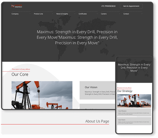
Prototype Video
See what Website looks like
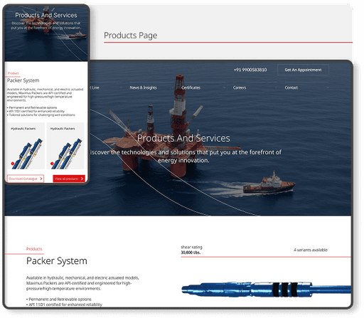
Products Page
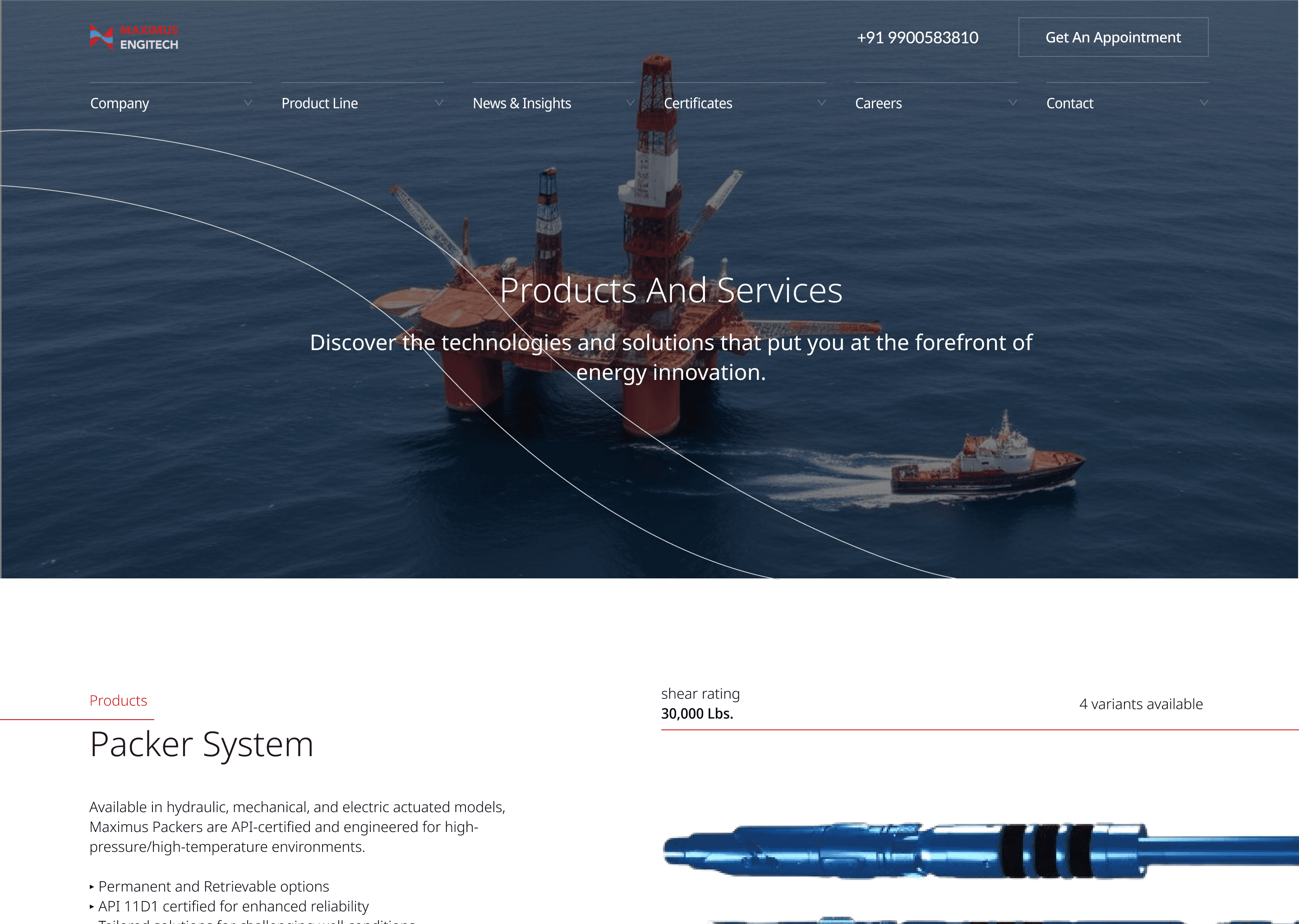
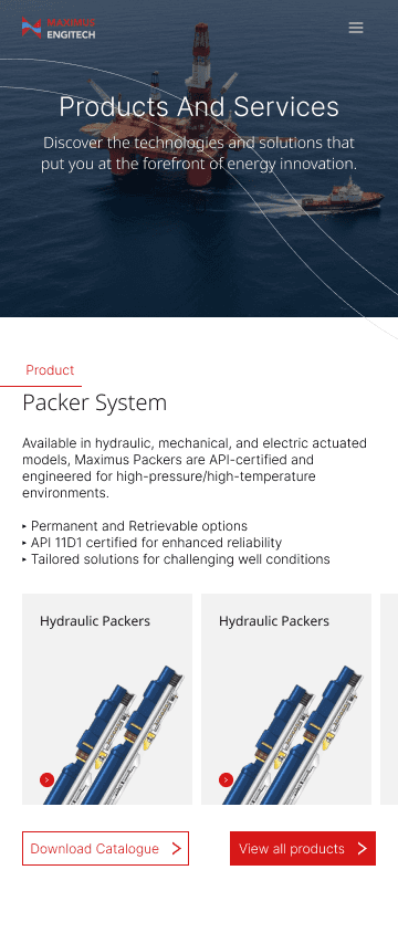
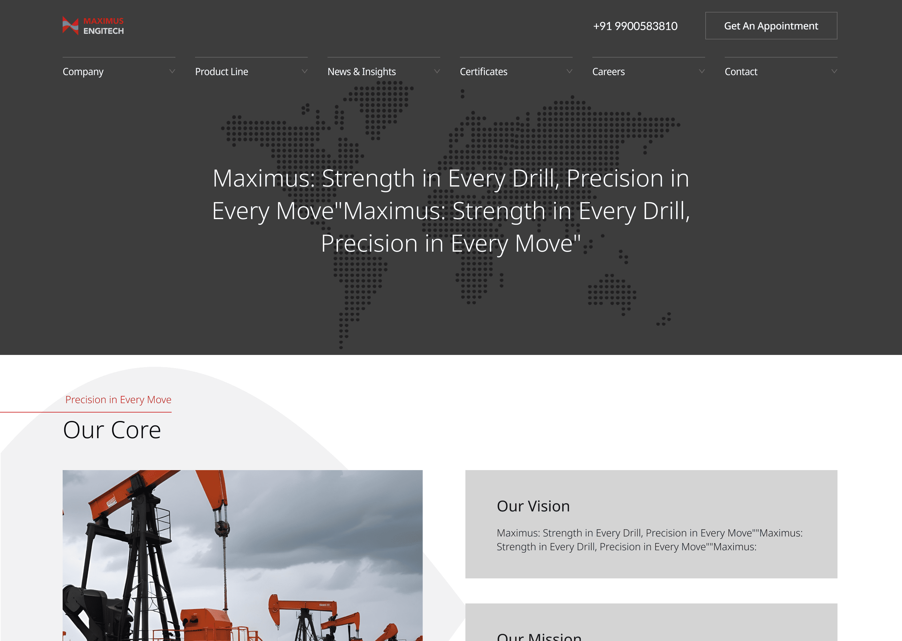
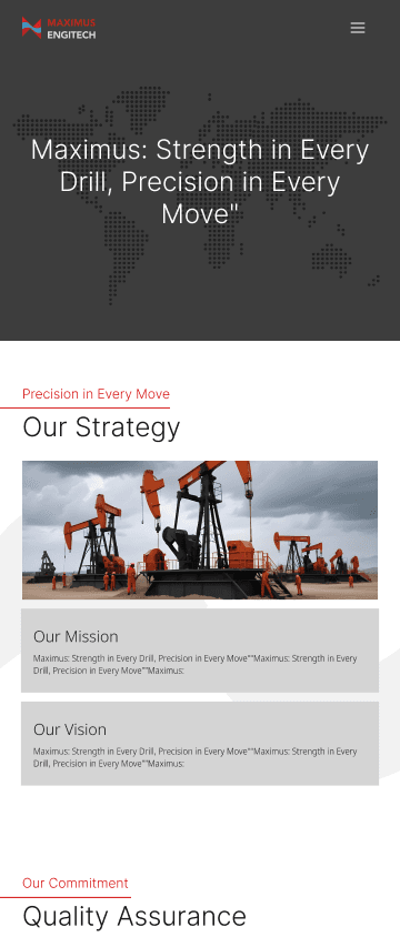
About Us Page


My Role
What did I do
User Research & Competitive Analysis
Assessed user expectations in the oil & gas sector and benchmarked key competitors.
1
Information Architecture
Restructured for clearer navigation, focusing on services, industries, & project highlights.
2
UX Design
Created intuitive user journeys for decision-makers, partners, & technicians.
3
UI Design
Designed a corporate interface where visual hierarchy is chosen to reflect strength & trust.
4
5
Responsive Design
Ensured seamless experience across platforms critical for field operatives & business partners.
6
Performance & Accessibility
Optimized visuals and layouts for fast load times and ADA-compliant contrast ratios.
My Role
What did I do
User Research & Competitive Analysis
Assessed user expectations in the oil & gas sector and benchmarked key competitors.
1
UI Design
Designed a corporate interface where visual hierarchy is chosen to reflect strength & trust.
4
Information Architecture
Restructured for clearer navigation, focusing on services, industries, & project highlights.
2
Responsive Design
Ensured seamless experience across platforms critical for field operatives & business partners.
5
UX Design
Created intuitive user journeys for decision-makers, partners, & technicians.
3
Performance & Accessibility
Optimized visuals and layouts for fast load times and ADA-compliant contrast ratios.
6
Impact
Impact
How did I help
How did I help
Redesign
Redesign
Brand Modernization
Brand Modernization
Replaced outdated visuals with a sleek, professional design that elevated trust and credibility.
CTA
CTA
Business-Ready UX
Business-Ready UX
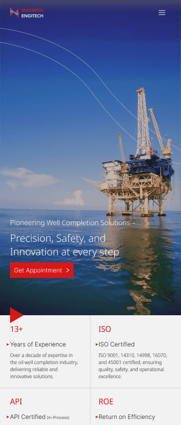
Streamlined layout and CTAs led to more quote requests and improved client engagement.
Responsive
Responsive
Mobile-Friendly
Mobile-Friendly
Responsive design enabled easy access for both corporate and field users.
Flexible
Flexible
Scalable Foundation
Scalable Foundation
Built a flexible, modern platform ready for SEO, analytics, and future growth.
Project Goals
The Purpose
Establish a modern, professional web presence
Improve user navigation & engagement
Communicate complex services simply & visually
Ensure responsive design for field-accessibility
Highlight safety, sustainability, and innovation
Clearly establish brand Identity
Redesign
Brand Modernization
Replaced outdated visuals with a sleek, professional design that elevated trust and credibility.
CTA
Business-Ready UX
Streamlined layout and CTAs led to more quote requests and improved client engagement.
Responsive
Mobile-Friendly
Responsive design enabled easy access for both corporate and field users.
Flexible
Scalable Foundation
Built a flexible, modern platform ready for SEO, analytics, and future growth.
My Takeaways
How did the project help me
Designing for technical fields means presenting complex data in a digestible, visually clean format that doesn’t overwhelm users.
Turning technical jargon into intuitive layouts, structured sections, and clear visuals helps users engage without prior deep expertise.
A professional, uniform look - paired with clear navigation - establishes credibility, especially in B2B industries where decisions carry weight.
Messaging and layout should instantly communicate what the company does - there’s little room for ambiguity in industrial sectors.
Thoughtful, well-written insights and guides not only inform but also position the company as an expert in its domain.
Strong headings, clear typography, and ample white space help users quickly grasp key information—even in long-form content.
How did the project help me
My Takeaways
Designing for technical fields means presenting complex data in a digestible, visually clean format that doesn’t overwhelm users.
Turning technical jargon into intuitive layouts, structured sections, and clear visuals helps users engage without prior deep expertise.
A professional, uniform look - paired with clear navigation - establishes credibility, especially in B2B industries where decisions carry weight.
Messaging and layout should instantly communicate what the company does - there’s little room for ambiguity in industrial sectors.
Thoughtful, well-written insights and guides not only inform but also position the company as an expert in its domain.
Strong headings, clear typography, and ample white space help users quickly grasp key information—even in long-form content.
