The Problem


Students drop in class PDFs and handwritten notes. The system handles categorization entirely. Zero setup fatigue.

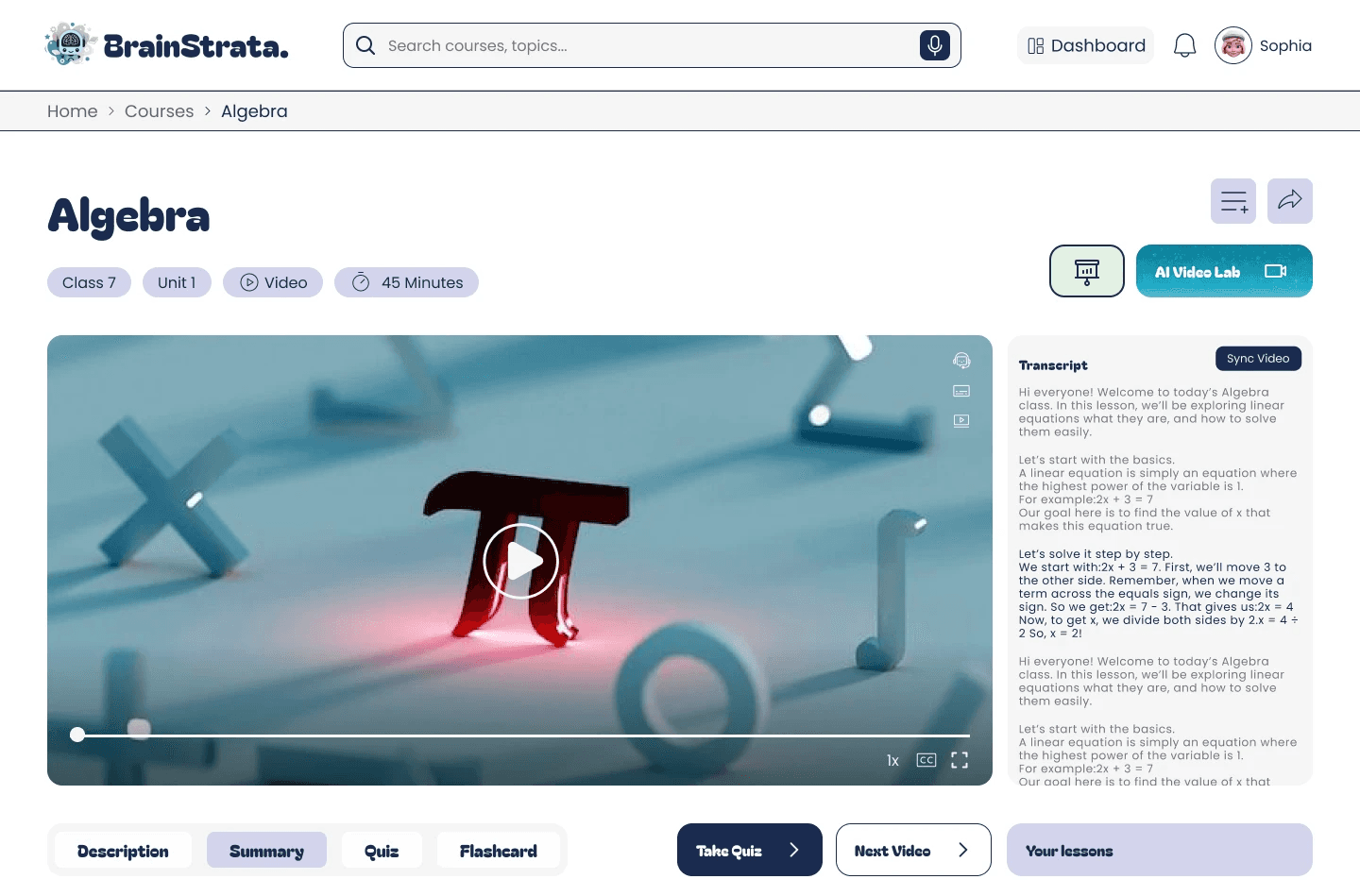
Flashcards, quizzes, and AI chat load as hot-swappable modules inside the core lesson viewport. Students never leave their focus space.
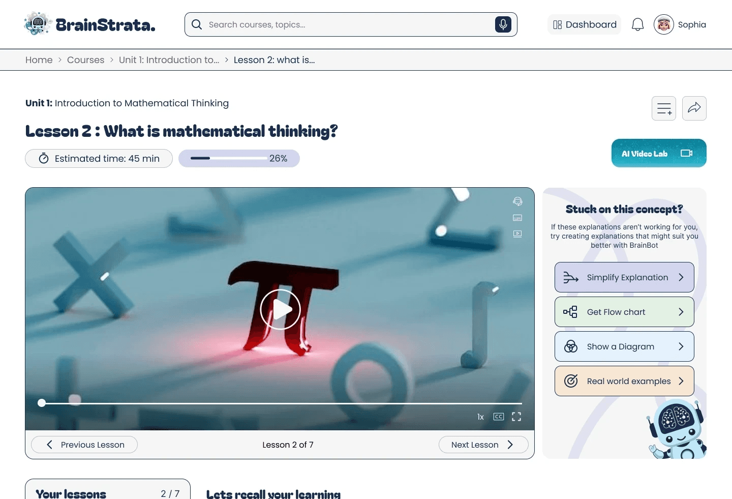
Finding 01 · Explanations Page

It is not obvious what the feature is for, why a student would use it, or how it fits into their learning journey. The page feels like a standalone tool that exists outside the main product experience.
✦ Design Response
Removed standalone Explanations page. Feature rebuilt as a contextual "Stuck on this?" panel that surfaces inline with the lesson no navigation required.
Finding 02 · Course Page
The course page does not feel like a "home" for the learner's progress. There are no visible metrics no % completed, no last activity, no indicator of where the user left off.
✦ Design Response
Redesigned course pages to surface progress indicators, streak data, time-spent, last viewed lesson, and a "next recommended action" prompt making them a true learning home base.
Finding 03 · Navigation Structure
Features like Flashcards and Create Course feel like tools users might accidentally discover while browsing tabs. Important tools are buried behind multiple clicks and nested navigation.
✦ Design Response
Elevated Flashcards and Create Course to dedicated, top-level navigation items. Each landing page rebuilt with an animated outcome preview so value is obvious before the user commits.
Finding 04 · Notes
During a session on GCSE Mathematics, the "Get Notes" panel surfaced a PDF titled "Ohm's Law" a physics document. This broke trust in the AI content system immediately.
✦ Design Response
Flagged to engineering as a critical trust-breaking defect. Simultaneously redesigned the feature label from "Get Notes" to "Course Notes" with supporting microcopy clarifying what will be generated.
Insight: First-time login created immediate decision fatigue
✦ Design Response
The dashboard splits user intent into two crystal-clear entry points: Create Course (upload your own material) and Explore Courses (start instantly). A persistent streak engine applies the Goal-Gradient Effect establishing a daily micro-commitment loop from the first session. Users don't browse; they have a reason to return.
Insight: Standalone Explanations page had near-zero discoverability
✦ Design Response
When testing showed the original Explanations page was invisible to users mid-lesson, I scrapped the standalone approach entirely. The redesigned system surfaces a "Stuck on this concept?" panel inline with the video player. One click no navigation. Macro buttons like "Simplify" or "Get Flowchart" remove the need for students to formulate prompts.
Insight: GCSE students felt patronized by generic gamification
✦ Design Response
Gamification in education is a tightrope. Too playful and 17-year-olds preparing for A-Levels disengage; too dry and KS3 students check out. Our Mini Games and Achievements arrays use rigid age-gated content tags (Ages 12+, Ages 15–25). Empty states were redesigned as instructional carousels active, not passive teaching users how to generate content on the fly.